A listener once shared that instead of setting creative goals, she chose a creative feeling for the season — and for the first time, she didn’t burn out halfway through the month.
🎙 This post pairs with the final February podcast episode. 📌 Find more seasonal inspiration on Pinterest. 💌 Subscribe to the newsletter for March’s creative focus.
When we talk about creativity as a safe place, we often focus on the emotional side.
But safety is also practical.
It’s the small systems that reduce frustration. The habits that prevent overwhelm. The stewardship that keeps our tools working for us instead of against us.
There’s a quiet pressure in creative spaces to “tell your story.”
But healing doesn’t require disclosure.
For many of us — especially trauma survivors — creativity was the first place we felt safe. And that safety can disappear quickly when we feel obligated to explain, share, or justify our experiences.
Your scrapbook does not need to be a public record.
One of the most powerful shifts happens when we stop asking “Will this make sense to others?” and start asking “Does this feel safe to me?”
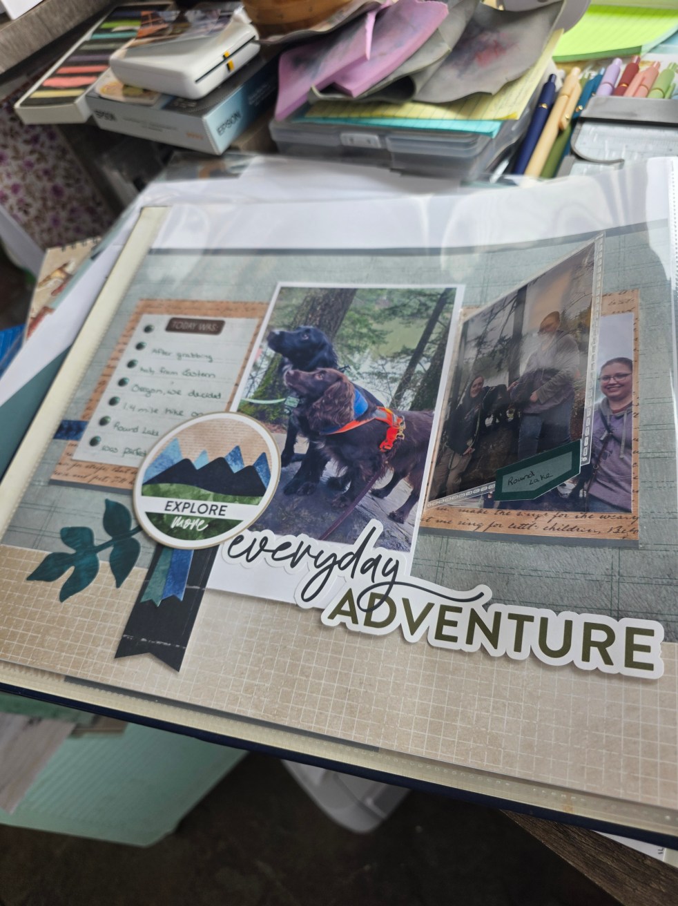
Safe Creation Ideas
Hidden journaling pockets
Writing thoughts on slips of paper and sealing them
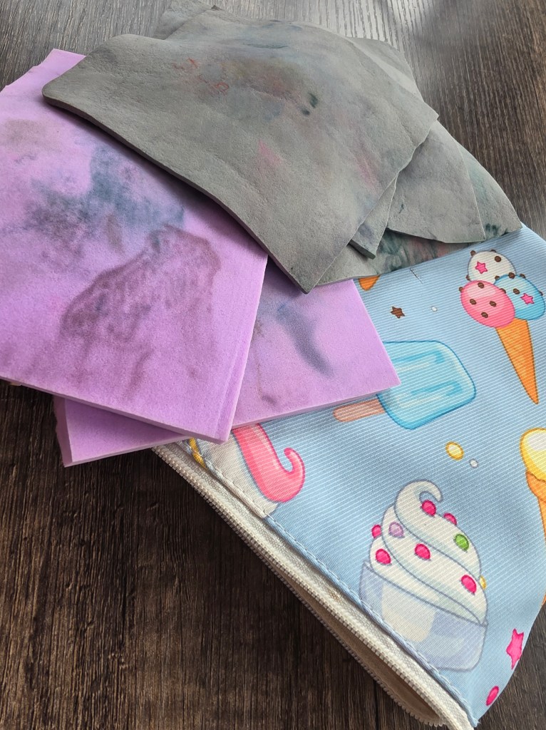
Using color and texture to express emotion
Your story belongs to you.
🎧 This post aligns with this week’s deeply grounding podcast episode. 🖊 Join the newsletter for a printable “safe journaling” guide. 🌿 Our VIP group is holding space for gentle sharing this week.
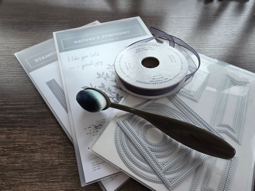
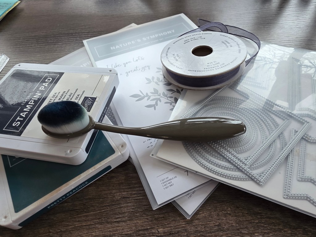
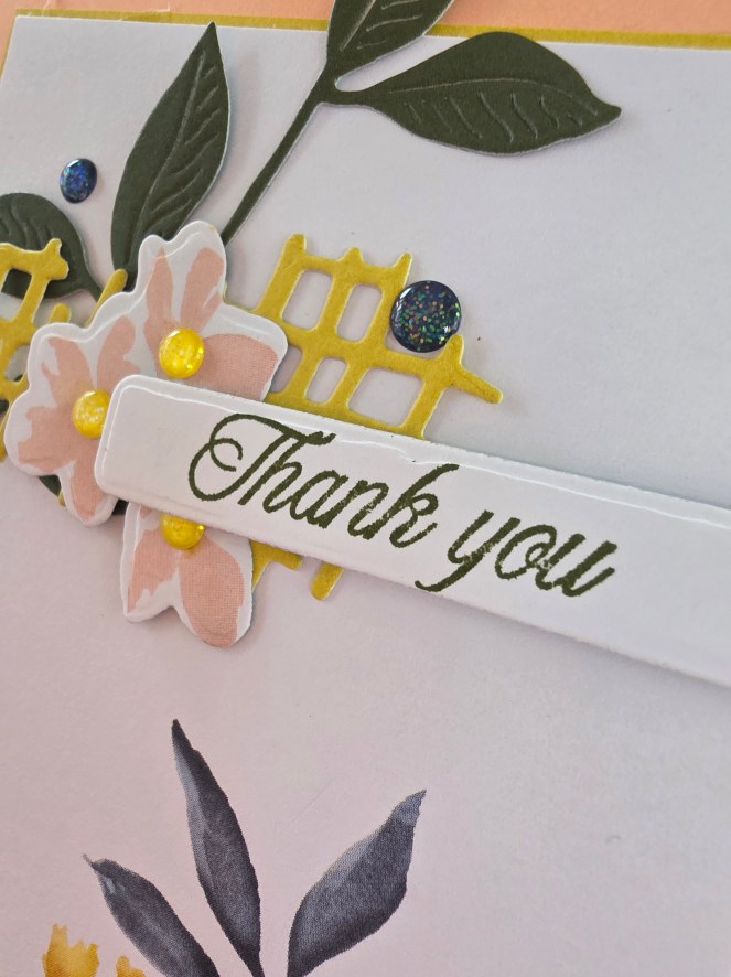
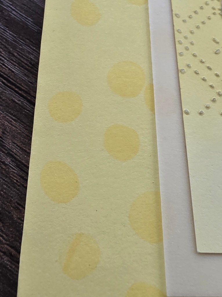
Today’s Color My Story Monday is all about tone-on-tone stamping — stamping Lemon Lolly ink directly onto Lemon Lolly cardstock to build a soft patterned background.
It’s a gentle technique.
Instead of high contrast, we’re building texture through repetition.
I love tone-on-tone for backgrounds because it:
• Adds interest without distraction • Creates cohesion • Feels calm and steady • Allows the focal image to shine
There’s something meditative about repeating a stamped image across a page in the same color family.
No drama. No pressure. Just rhythm.
In a season of cultivation, this technique feels right.