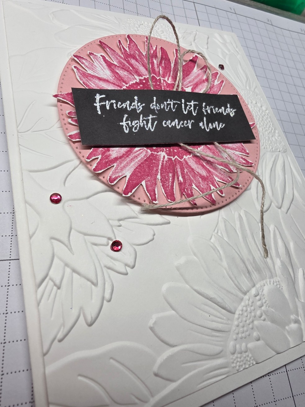
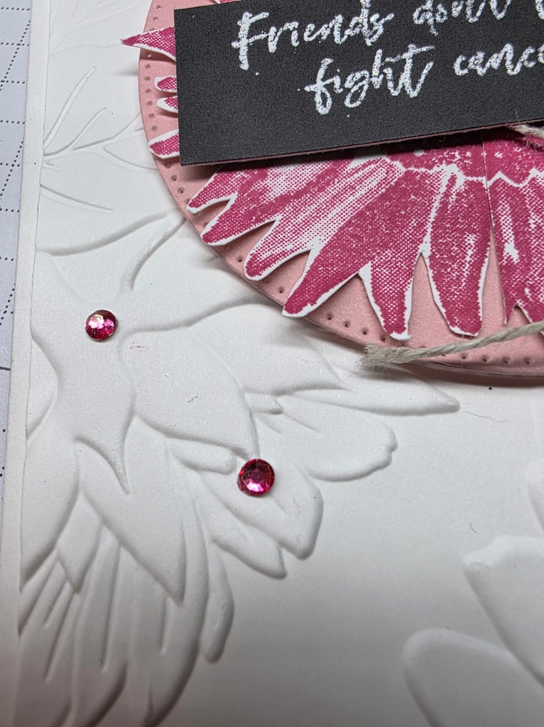
Today we’re beginning December with softness and light. This Flower Alone Card uses Melon Mambo to bring warmth, embossed texture to bring grounding, and a powerful message of compassion. On the blog today, I’m sharing how to personalize your embellishments using Stampin’ Blends + Rhinestone Basics.
See how tiny pops of color bring a story to life → Here
Gratitude, like flowers, grows best in gentle light. It doesn’t need a perfect day — only presence, intention, and space to open.
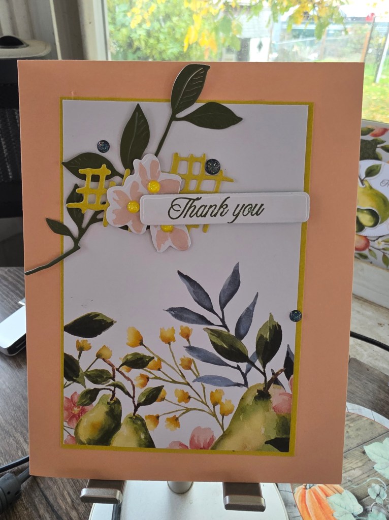
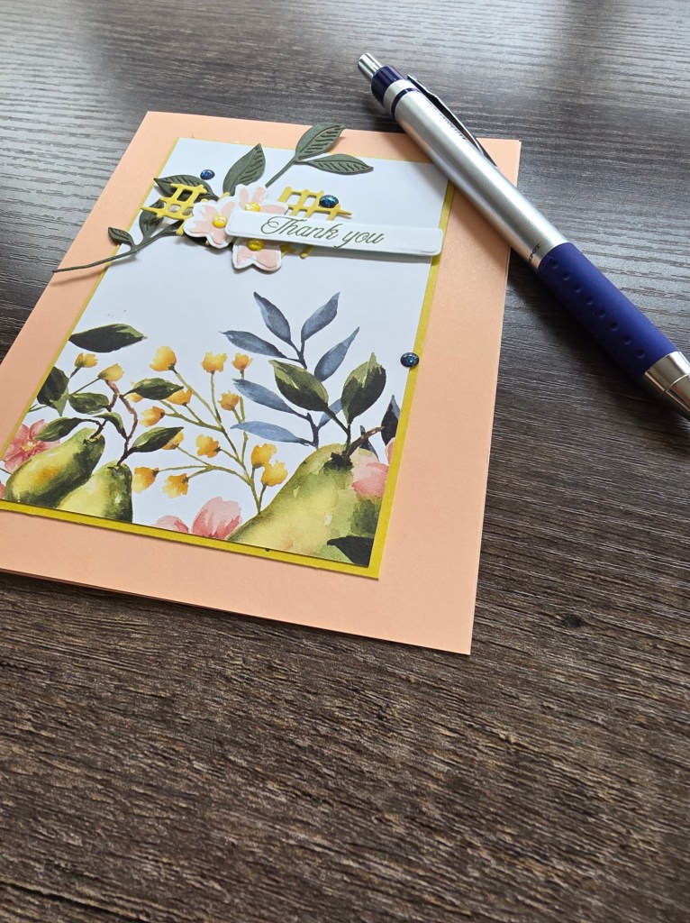
This week, my creative table feels like a garden in bloom. Between the soft tones of Petal Pink and the grounded calm of Mossy Meadow, today’s Petal Thanks Card reminds me how “thank you” can feel both delicate and strong.
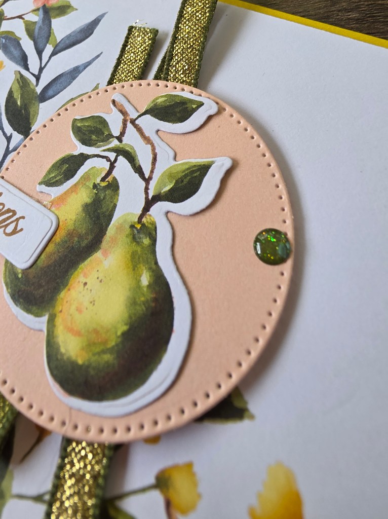
I started with Perfectly Pears as my foundation — its timeless botanical design fits this month’s reflection on abundance perfectly.
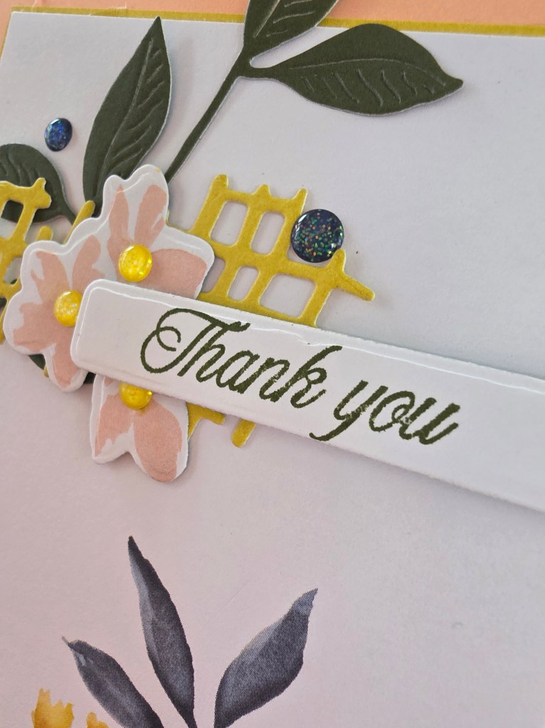
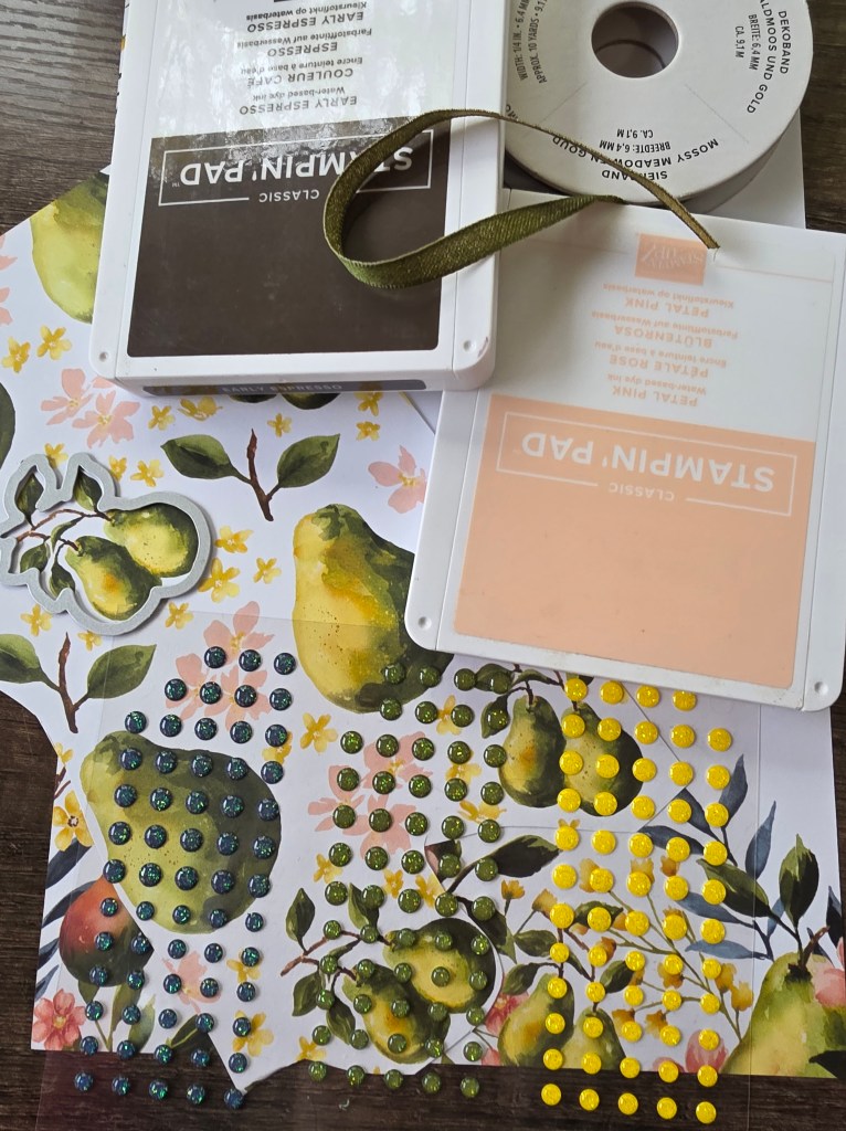
The Painterly Pears DSP provided that soft floral-meets-fruit print, and I layered it onto Darling Duckling cardstock for contrast. I love how the yellow glow pulls the viewer’s eye to the stamped sentiment — “Thank you” — like sunlight through autumn leaves.
Each layer was an act of slowing down: aligning edges, smoothing ribbon, placing dots one at a time. Gratitude feels a lot like that — steady, simple, intentional.
Saying “thank you” is more than good manners — it’s a creative practice. Each time we express it, we build a new layer of connection — just like paper upon paper.
When I finished this card, I didn’t just see layers of cardstock. I saw layers of moments — every kindness, every shared conversation, every reminder that creativity connects us back to one another.
Find the Perfectly Pears Bundle, Painterly Pears DSP, and coordinating embellishments here: 👉 Shop Perfectly Pears on my DBWS
💌 Join the Community
Join the Gems Paper Scissors VIP Group for daily gratitude prompts, creative healing projects, and heartfelt conversation: 👉 facebook.com/groups/GemsPaperScissorsVIP
Gratitude doesn’t need to shout to be heard. It can whisper through color, rest quietly in layers, and still change everything it touches.
Sometimes, connection looks like color. Like the first swirl of Calypso Coral on a fresh piece of white cardstock, reminding you that you’re creating something joyful — something that can brighten someone else’s day.
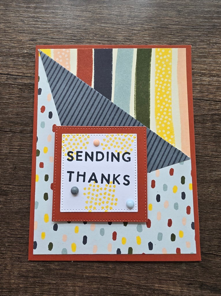
Today’s Calypso Congrats Card is a celebration of those moments — the small wins, shared smiles, and quiet cheers that connect us through gratitude.
I started this card with the Darling Duckling base — its sun-kissed warmth feels like a celebration before the first stamp even touches paper.
After scoring at 3½” and 6¼”, I added the framed pear print from the Painterly Pears DSP. That pattern anchors the layout while keeping the design open and friendly — just like the word “Congrats.”
Using Sponge Daubers, I blended Calypso Coral and Darling Duckling inks on the pear stamps to create a natural gradient. Then I deepened the leaves with Old Olive Blends and added tiny Pecan Pie shadows for depth.
Each stroke reminded me that celebration doesn’t have to be loud — sometimes it’s a warm gesture shared quietly through paper and ink.
💡 Technique Tip: Use a light touch with the Sponge Dauber — let the colors overlap naturally so your pear feels hand-painted. Blend Calypso Coral into Darling Duckling for a sun-to-shadow effect.
Every “congrats” we give is a connection. When we acknowledge each other’s progress — no matter how small — we strengthen the fabric of our creative community.
Crafting this card felt like writing a thank-you note to everyone who’s cheered me on this year: my team, my clients, my friends, and you — my fellow creatives who believe in beauty and healing through art.
There’s something special about growth you can’t always see.
Sometimes it’s a seed beneath the soil or a half-finished layout waiting on your desk. Other times, it’s the quiet progress we make as artists and as people — layering one mindful choice at a time.
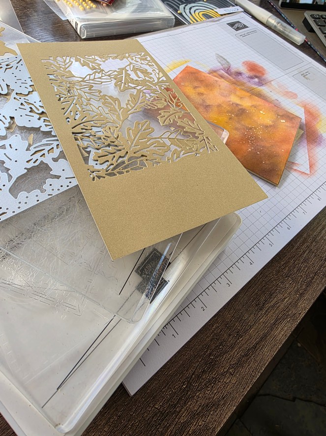
Today’s project, feels like that kind of growth. With the Perfectly Pears Bundle, a touch of Mossy Meadow, and the shimmer of Low Profile Sparkle Dots, this design celebrates the beauty of patience, texture, and gratitude in progress.
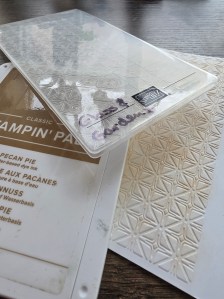
I began by embossing the smaller Basic White panel with the Glass & Garden Embossing Folders — their delicate texture instantly adds quiet movement. That tactile dimension always reminds me that even subtle pressure can shape something beautiful.
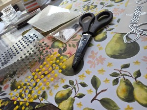
Next, I layered a fussy-cut pear cluster from the Painterly Pears DSP near the top corner, grounding it with a Mossy Meadow sentiment strip stamped “Congrats.”
Each brush of ink and ribbon tail felt symbolic: small acts of progress that lead to gratitude. The finished card has a balance of stillness and sparkle — a creative metaphor for calm in motion.
💡 Creative Tip: For added depth, lightly sponge Pecan Pie ink over your embossed surface before adhering your layers — it gives the texture an antique warmth without overpowering the white space.
Every handmade piece carries a story — not just of the paper or ink, but of who we were while making it. This card taught me that growth doesn’t always come with a loud “before and after.” Sometimes, it’s quiet. Layered. Patient.
If you’ve ever felt like you’re standing still, remember: the roots of gratitude are growing, even when you can’t see them. 🌱
You can find the Perfectly Pears Bundle, Glass & Garden Embossing Folders, and all featured supplies through my Stampin’ Up! shop here
Want to grow alongside fellow makers who understand that creativity is a healing process? Join my Gems Paper Scissors VIP Group for daily prompts, project videos, and mindful inspiration. 👉 Join our Facebook VIP Group
Or sign up for my Tuesday Newsletter to receive weekly gratitude journaling tips and sneak peeks straight to your inbox. 👉 Subscribe via Constant Contact
Today’s behind-the-scenes photo set — including embossing details and color swatches — is up on Lemon8! 👉 @GemsPaperScissors on Lemon8
Gratitude doesn’t always arrive with fireworks. Sometimes it looks like a pear in progress — ripening quietly under autumn light. Today, let your creativity remind you how far you’ve come, and trust that every layer of ink and intention adds to your harvest of growth. 🍐💛
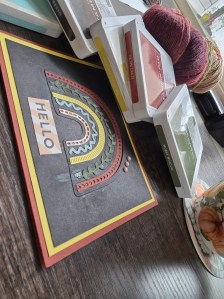
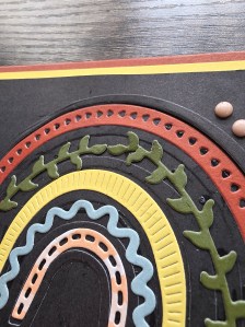
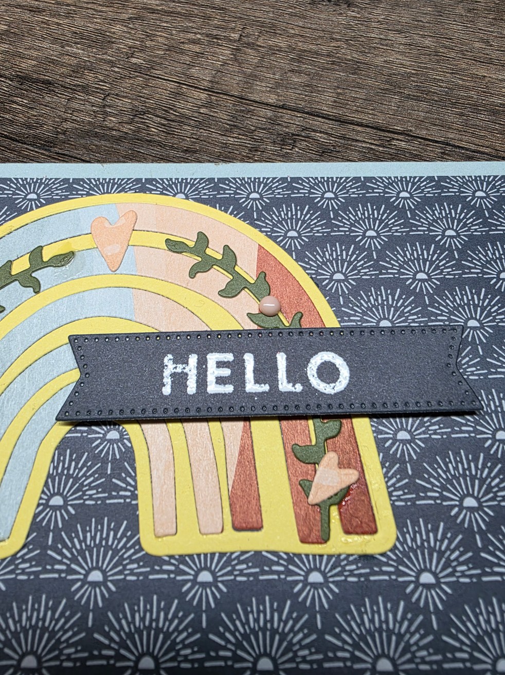
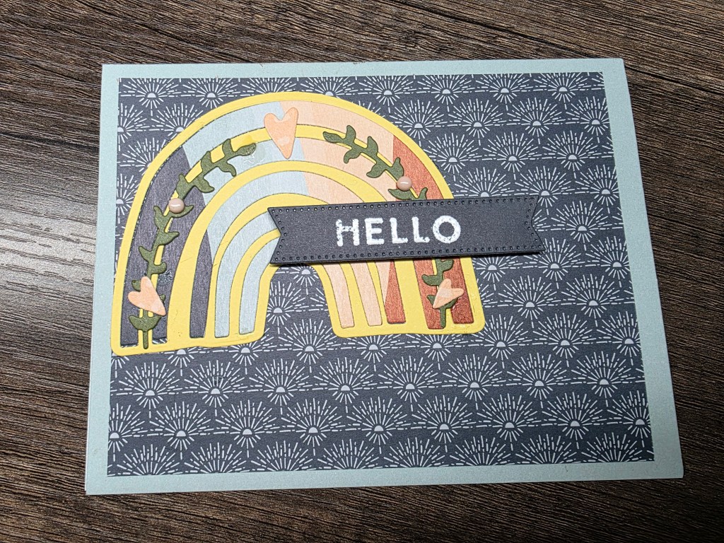
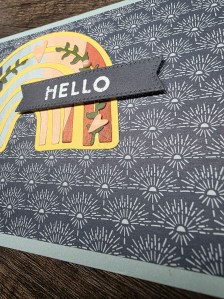
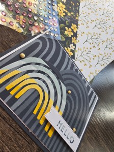
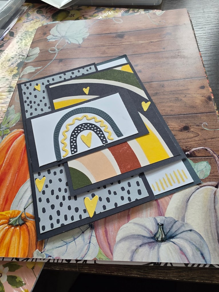
As we near the end of October, I’m finding joy in the ways color can connect us. Each shade tells part of our story — warmth, change, hope, and reflection. This week’s Boho Hello Card blends Daffodil Delight, Basic Black, Cajun Craze, Mossy Meadow, Pool Party, and Petal Pink — a palette that feels like both sunlight and shadow, capturing the balance of fall perfectly.
When I started this project, I wanted to express gratitude through color — the way each tone complements the next without overpowering it. Daffodil Delight adds warmth and optimism, Cajun Craze brings grounding energy, Mossy Meadow centers it, and Pool Party lifts it all into light again.
Each color has its own role, but together, they create harmony — much like a creative community built on individual strengths.
“Boho” to me means freedom — the permission to mix structure with spontaneity. This card is layered, imperfect, and full of heart. I added touches of Basic Black and Petal Pink for balance — contrast and calm, like gratitude and growth side by side.
Color has emotion. It tells stories when words feel too heavy — stories of comfort, change, and courage. So today, as you create, pause to notice what colors you’re drawn to. They might be saying what your heart already knows.
💬 What colors describe your gratitude right now?
As we blend colors and stories this week, remember that creativity connects us. Every hue, every handmade hello, every shared story adds to the tapestry of gratitude we’re creating together.
Sometimes, it’s not the grand gestures that make the biggest impact — it’s the quiet, heartfelt moments. This week, my Hello Card reminds me that gratitude doesn’t always need a speech; sometimes, it’s as simple as reaching out to say hi.
There’s something grounding about crafting cards with simple sentiments. The word “hello” is universal — it’s both a beginning and a continuation, an invitation to reconnect.
When I designed this card, I chose soft golds, warm neutrals, and a touch of texture to mirror that feeling. It’s not about perfection; it’s about presence.
In a digital world of instant messages and scrolls, a handmade card still carries unmatched magic. It’s tangible — something you can hold, display, and feel. And behind every handmade “hello” is time, intention, and love — the most human elements of connection.
As the month closes, I’m grateful for all the little connections — the comments, messages, and creative shares that bring this community to life.
💬 Reflection Prompt: Who in your world could use a small hello today? Maybe a friend, a neighbor, or someone who once supported you when you needed it most.
Send them something — even a quick text or handmade note — just to say you’re thinking of them.
This week, let your creativity become a bridge. A simple hello can change someone’s day — and it costs nothing but your presence. 💛
As October draws to a close, I’ve been reflecting on how change shows up in our creative lives. Sometimes it’s bold — like a shift in seasons — and other times it’s subtle, a gentle blending from one shade of life to another.
Today’s Amber Autumn Blending project captures that transition perfectly, with warm fall tones of Blackberry Bliss, Cajun Craze, and Crushed Curry. The way they meet and merge reminds me that change doesn’t have to clash; it can create something unexpectedly beautiful.
When I first started blending these colors, I didn’t plan the transitions — I just let the ink move. That’s often how life unfolds, too — we can’t always predict where the hues will merge, but somehow they always find balance.
Creative tip: To achieve that glowing “sunset warmth,” begin with Crushed Curry as your lightest tone, layer Cajun Craze in the midtones, and deepen the edges with Blackberry Bliss. Use circular motions and patience — like practicing gratitude, it’s less about control and more about flow.
The Emotional Palette of Fall
These colors — rich, warm, grounded — carry emotional meaning too:
Crushed Curry = light and optimism
Cajun Craze = warmth and courage
Blackberry Bliss = depth and introspection
Together, they remind me that change isn’t about letting go of one phase, but carrying pieces of each forward.
There’s something soothing about blue — the color of open skies, deep waters, and quiet reflection. This week, as we linger in Gratitude in the Everyday, I found myself craving that kind of calm — the pause between breaths where appreciation takes root.
Today’s project, the Hello in Blues Card, is my creative meditation. It’s simple and layered, soft yet grounded, much like gratitude itself.
When I sat down to make this card, I didn’t start with a plan. I just knew I wanted to capture the feeling of peace. Sometimes, creativity is our way of returning home — to ourselves, to stillness, to the part of us that knows how to breathe again.
I mixed soft navy with watercolor blues and touches of white for balance. Layered textures — a bit of embossed vellum here, some stitched details there — helped the piece feel grounded. It reminded me that even in seasons of chaos, small creative moments bring clarity.
Color has a quiet power. Blue especially invites introspection and gratitude — not the flashy kind, but the quiet noticing that says, “I’m here, and this is enough.”
Creating this card was a mindfulness exercise. Every ink swipe, every press of the stamp became a rhythm of release. When we allow creativity to slow us down, we discover what peace feels like in real time.
As you create this week, pause between steps. Feel the paper, watch the ink spread, and notice how you breathe differently when you’re focused on color and texture instead of speed.
Gratitude isn’t always loud joy — sometimes, it’s the quiet calm that whispers, “You made it this far. Breathe.”
💙 Reflection Prompt: What color feels like peace to you right now?
If you’re seeking calm or creative restoration, I encourage you to make your own “hello in blues” piece this week. Tag it with #CozyConnections and #CreativeGratitude so we can celebrate your creativity together.
✨ And if you’re craving more creative peace, this week’s Gems Paper Scissors Podcast (Episode 35: The Gentle Art of Shared Gratitude) pairs beautifully with this project. Listen while you create — and let it remind you that peace and gratitude are waiting in the quiet moments we give ourselves.
As October begins to wind down, I’ve been thinking a lot about gratitude — not just the kind we feel, but the kind we share.
There’s a beautiful unfolding that happens when we take gratitude out of our thoughts and put it into action. It could be a simple “thank you,” a note, or in our creative world — a handmade card that carries warmth and care beyond words.
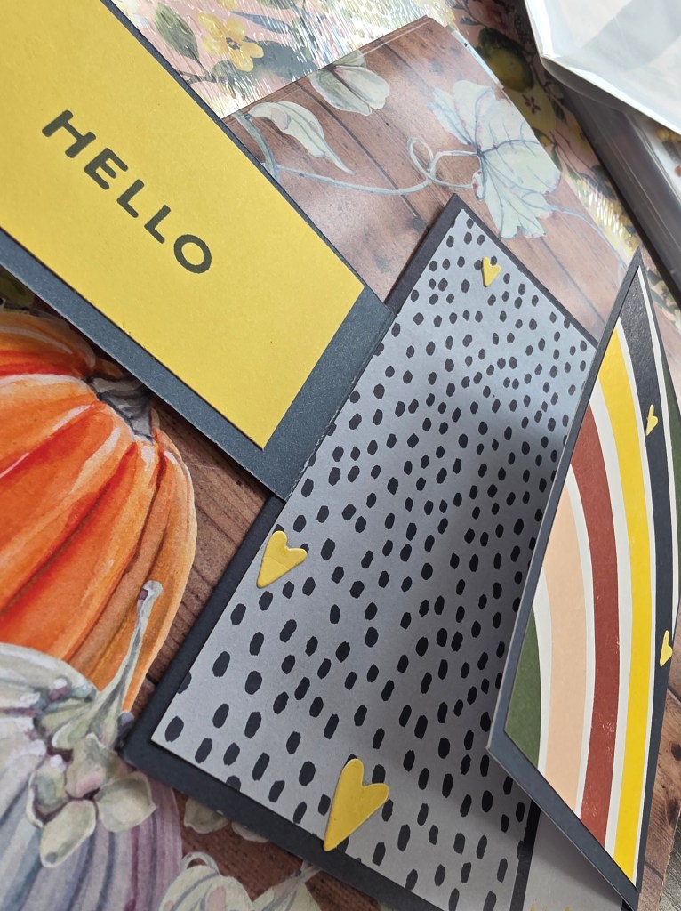
That’s exactly what today’s Hello Fun Fold Card represents. Each fold reveals a new layer, just like each expression of gratitude reveals something deeper within us.
There’s something deeply healing about expressing gratitude — especially when it’s shared through something handmade.
A few years ago, I received a card from a friend during one of the hardest seasons of my life. It was simple — pastel paper, stamped words, and a note that said, “You make the world softer.” That card stayed pinned above my workspace for months because every time I looked at it, I felt seen.
That’s the magic of shared gratitude. It connects us. It reminds us we’re not alone in this creative, messy, beautiful life.
When we take time to make something from the heart — and share it — we create ripples of kindness that extend far beyond our own table.
Gratitude isn’t just something we give — it’s something that grows. Every time you express it, even in a small way, it strengthens the threads between you and others.
So this week, I invite you to create your own ripple. Make one card, write one thank-you note, or simply reach out to someone who’s been on your mind. It doesn’t have to be perfect — it just has to be heartfelt.
Because when gratitude moves from your heart to your hands, it becomes something living.
Listen to Episode 35: The Gentle Art of Shared Gratitude 🎧
This week’s podcast episode dives even deeper into how creativity, gratitude, and healing intertwine. I share stories of how handmade cards and heartfelt connections have helped me — and many others — navigate life’s ups and downs.
💛 Listen now:
Join the Conversation
✨ Share your own gratitude story or photo in the Gems Paper Scissors VIP Group. ✨ Leave a comment below — who are you grateful for this week? ✨ Tag your creative gratitude projects on Instagram with #CozyConnections and #CreativeGratitude.
Closing Thought
Gratitude deepens when we share it. Whether through color, paper, ink, or words — each gesture is a reminder that we’re part of something bigger, something warmer, something beautifully human.
So go ahead. Fold your card. Write your note. Share your heart. The world could use your gratitude today. 💛
Gratitude doesn’t always need grand gestures — sometimes it’s the whisper of a thank-you card, the memory of a shared laugh, or the calm that comes from pausing mid-project to appreciate the process itself.
Focus on warmth + texture (embossing folders, layered dies).
Add a natural accent — linen thread, twine, or vellum.
End with a reflection: “What part of your creative process are you most thankful for?”
share one moment of gratitude in the VIP group or comment below.