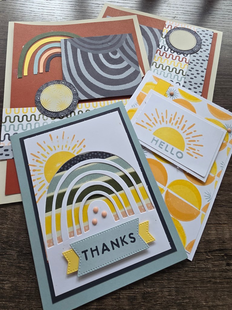
There’s a moment at the craft table that almost every paper crafter has experienced.
You open a brand-new stamp set.
You ink it up with excitement.
You press it down…
And the image comes out patchy, uneven, or frustratingly incomplete.
It’s such a small thing — but it can shift the entire mood of a creative session.
What was meant to be calming suddenly feels irritating.
What was supposed to be joyful feels like work.
And for those of us who come to creativity not just to make, but to regulate, process, or rest — those small frustrations matter.
That’s why today, for Thoughtful Thursday, I want to talk about something very practical that’s also deeply aligned with creative care:
Conditioning your stamps before first use.
Not as a rule.
Not as a requirement.
But as an act of intention.
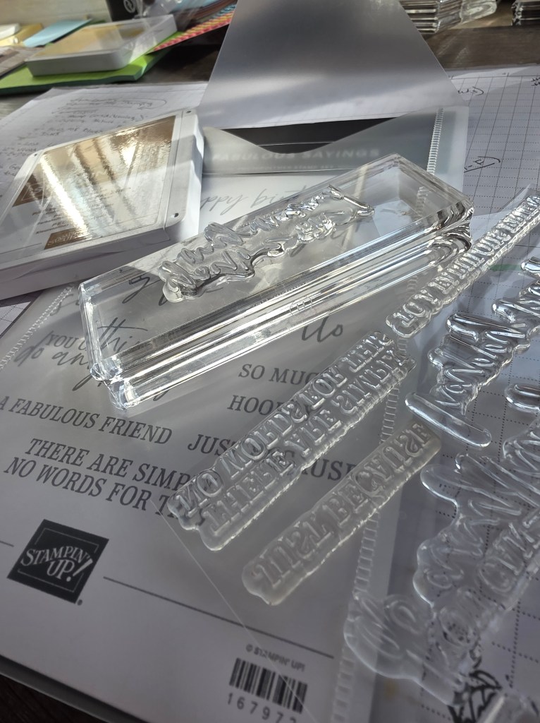
What Does It Mean to “Condition” a New Stamp?
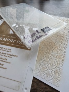
When stamps are brand new — especially photopolymer stamps — they often have a slight residue from the manufacturing process. That residue can prevent ink from fully adhering to the surface, which leads to uneven stamping.
Conditioning a stamp simply means gently preparing it so it accepts ink more evenly.
There are a few simple ways to do this:
- Lightly rubbing the stamp surface with an eraser
- Stamping it several times on scrap paper
- Using a very gentle cleaning cloth before the first use
The goal isn’t to scrub or damage the stamp — it’s to wake it up.
And that’s such a beautiful metaphor.
Why This Matters More Than We Think
On the surface, conditioning stamps is about better ink coverage.
But underneath that, it’s about something deeper.
It’s about removing unnecessary friction from the creative process.
When tools don’t behave the way we expect them to, our nervous system often interprets that as failure — even when it isn’t. Especially if we’re already tired, emotionally tender, or short on time.
That tiny moment of frustration can be enough to make us close the stamp case, clean up the table, and walk away feeling defeated.
Conditioning stamps is a way of saying:
“I’m allowed to prepare.”
“I’m allowed to make this easier.”
“I don’t have to push through frustration to prove anything.”
That mindset is at the heart of Cultivate.
Cultivating Ease at the Craft Table
Cultivation isn’t about rushing growth.
It’s about tending the environment.
Gardeners don’t blame the seed when the soil isn’t ready.
They prepare the soil first.
Conditioning stamps is the same idea — just translated to paper crafting.
It’s not about perfection.
It’s not about control.
It’s about creating conditions that support the experience you want to have.
A calmer session.
A smoother flow.
A softer entry into creativity.
When Creativity Is Also a Mental Health Tool
For many of us, crafting isn’t just a hobby.
It’s:
- A way to decompress
- A place to process emotions
- A moment of grounding in a chaotic day
When creativity carries that kind of emotional weight, the setup matters.
Every small barrier — dull blades, sticky adhesives, stamps that don’t ink well — adds stress that doesn’t need to be there.
Thoughtful preparation is not overthinking.
It’s self-respect.
And that applies far beyond stamping.
A Gentle Invitation
If you’re opening a new stamp set soon, I invite you to try this:
Before inking it up for a “real” project, take a moment to condition it.
Not in a rushed way.
Not as a chore.
But as a pause.
Notice how it feels to prepare instead of react.
Notice how your body responds when the stamp image comes out crisp and even.
That’s not just good stamping — that’s regulation.
A Thoughtful Thursday Reminder
Creativity doesn’t have to start at full speed.
Sometimes it starts with:
- wiping a surface
- preparing a tool
- setting yourself up for success
Those small, thoughtful choices ripple outward.
They shape how we experience our craft.
They shape how long we stay at the table.
They shape whether creativity feels nourishing or draining.
Today, let’s cultivate ease — one prepared stamp at a time.
Stay Connected 🌱
🎥 Today’s Thoughtful Thursday video demonstrating stamp conditioning is available in my VIP group.
💬 Join us there for gentle tips, supportive conversation, and creative community.
📸 Follow along on Instagram for daily creative reflections.
🎧 New podcast episodes every Wednesday explore creativity as healing and storytelling.
Thank you for being here — and for tending your creativity with care.