Yesterday, I needed to step away.
Not from creativity.
Not from this community.
But from noise.
At my day job, I was reminded — very directly — of how real and painful child abuse still is in our world. It stirred up old memories from my own childhood. Things I’ve survived. Things I’ve worked hard to process. Things that don’t disappear — but do soften with time and intention.
Instead of pushing through and pretending everything was fine, I did something different.
I paused.
That pause is cultivation.
Cultivation isn’t about productivity.
It’s about tending what needs tending.
So today’s Thoughtful Thursday feels especially fitting.
The topic is practical:
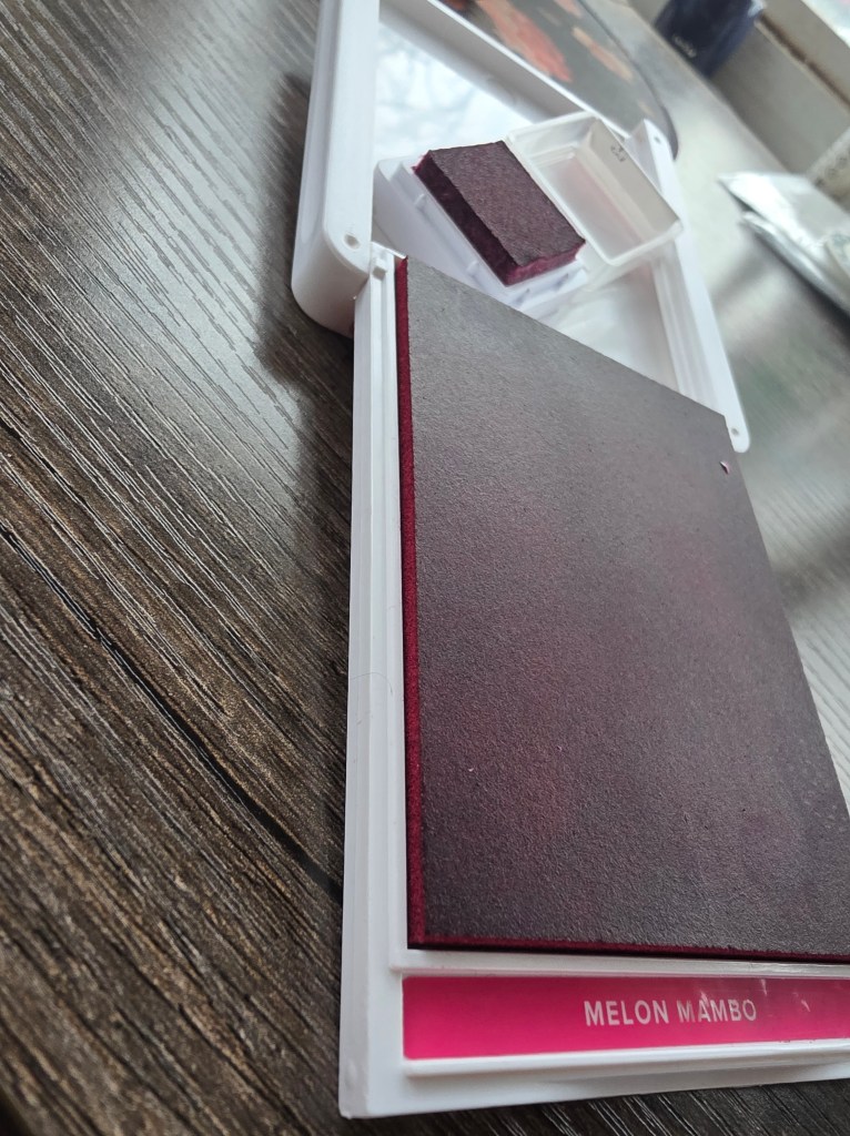
Frequently Asked Questions about Stampin’ Up! Designer Series Paper (DSP).
But beneath the technique is something deeper.
When life feels heavy, we return to what we know.
We return to texture.
To color.
To paper in our hands.
Designer Series Paper can feel “too pretty to cut.” I hear that often. But here’s the truth: paper is meant to be used. Creativity is meant to move. Beauty is meant to be part of our daily lives — not stored away waiting for perfect circumstances.
DSP FAQ highlights from today’s video:
- How to choose patterns without overwhelm
- Why cutting into it is an act of trust
- How to mix bold and subtle prints
- What to do with scraps
When trauma resurfaces, it can make us feel small.
When we create, we reclaim space.
That doesn’t erase what happened.
But it reminds us we are not powerless.
Surviving is real.
Thriving is intentional.
Cultivating strength means choosing small supportive actions — like stepping away when needed, and returning when ready.
Thank you for being part of a community that understands that both things can exist: real life and creative healing.
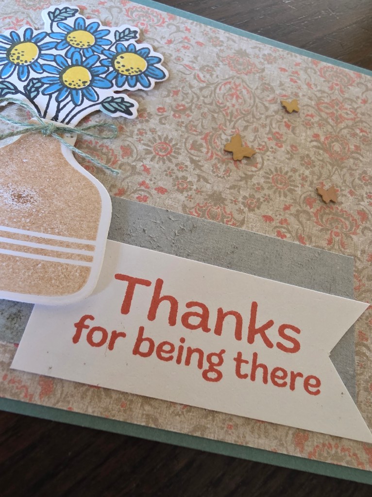
Tomorrow, I’ll share a card titled “Thanks for Being There.” And I mean that sincerely.
If you’ve ever had to pause for your own well-being — I see you.
If creativity has helped you survive something hard — I see you.
And if today all you can do is breathe — that counts too.