Uncategorized

It’s Okay to Not Be Okay: A Creative Reminder for Tender Seasons

December carries a strange kind of magic… a mix of sparkle and shadow, joy and ache, celebration and exhaustion. And in the middle of all that emotional complexity, many of us need the reminder that inspired today’s card:

It’s okay to not be okay.

Today’s project — the Pink Okay Card — is emotional storytelling through color and texture. It blends soft Pretty in Pink, grounding Pecan Pie ink, layered Stylish Shapes, and the powerful Light of Aurora DSP swirls.

But this isn’t just a card tutorial.
It’s a conversation about permission.
About compassion.
About honoring the truth of how you feel today — not how you “should” feel.


🌿 The Heart Behind the Design

Crafting has always been a form of healing for me — a space where my hands can express what my voice sometimes can’t.

For many of us, this season stirs up:

• Grief resurfacing
• Unexpected heaviness
• Overwhelm
• Fatigue
• Stress and sensory overload
• Tenderness around memories
• Hope that flickers instead of shines

And in that emotional swirl, I wanted today’s design to feel like a soft hand on the shoulder. A whisper saying:

“You don’t have to perform.
You don’t have to pretend.
You don’t have to be okay today.”

The sunflower image — stamped in Pretty in Pink and overlaid with warm golden tones — symbolizes resilience wrapped in softness. The Lights of Aurora DSP echoes this idea with its brushstroke-like blend of purples, pinks, and glowing white light.

Nothing about this card demands perfection.
Everything about it invites gentleness.


🎨 Today’s Color Story: Pretty in Pink + Pecan Pie + Aurora Glow

Color carries emotional meaning.
Pretty in Pink is a color of softness, vulnerability, openness.
Pecan Pie adds grounding, stability, and truth-telling.
The Lights of Aurora DSP brings motion, depth, and mystery.

Together, they create a visual reminder that:

Tenderness and strength can coexist.
Uncertainty and beauty can share the same space.

When you create with emotional intention, your projects become more than paper — they become anchors. They become safety. They become moments of truth.


🌸 Supplies + Measurements

Stamps: Love & Courage
Dies: Stylish Shapes
Ink Pads: Pretty in Pink, Pecan Pie
Other: Sunflower 3D embossing folder, Frosted Iridescent Dots

Cardstock & Paper:

  • Pretty in Pink
    • 5-1/2″ x 8-1/2″ (card base)
    • 1-3/4″ x 4-3/4″
    • 3″ square (die-cut)
  • Basic White
    • 4″ x 5-1/4″
    • 2-1/2″ square (die-cut)
    • Scrap
  • Lights of Aurora DSP
    • 1-1/2″ x 4-1/2″

How This Card Tells a Story

1. The embossed sunflower background

Sunflowers turn toward the light — even when it’s faint.
This embossed panel grounds the message in gentle resilience.

2. The layered Stylish Shapes

Stacking the squares symbolizes stability — something many of us crave in the winter season.

3. The imperfect, blended sunflower

A touch of Pretty in Pink paired with golden Pecan Pie creates a bloom that feels tender, warm, and very human.

4. The sentiment

It’s okay to not be okay.
Not just stamped — believed.

5. Frosted Iridescent Dots

They mimic tears or dew or tiny glimmers of light — depending on what your heart needs them to be.


💗 Creative Reflection Prompt:

Take a moment and ask yourself:

“Where can I offer myself more compassion today?”

Sometimes healing begins with a whisper.
Sometimes it begins with a card.
Sometimes it begins with crafting pink petals until your heart softens.

Wherever you are today, you’re not behind.
You’re not alone.
You’re not doing it wrong.

You’re simply human — and that is enough.


🧡 Want the Full VIP Tutorial?

Inside our private community, today’s full Make Along Tuesday video walks you through this layered construction step-by-step.

You’ll also find the emotional journaling prompt of the day, technique tips, and a safe creative space to breathe.

Join us on Facebook in our VIP Group!

Uncategorized

Celebrating Connection — The Color of Congratulations

Sometimes, connection looks like color.
Like the first swirl of Calypso Coral on a fresh piece of white cardstock, reminding you that you’re creating something joyful — something that can brighten someone else’s day.

Today’s Calypso Congrats Card is a celebration of those moments — the small wins, shared smiles, and quiet cheers that connect us through gratitude.

I started this card with the Darling Duckling base — its sun-kissed warmth feels like a celebration before the first stamp even touches paper.

After scoring at 3½” and 6¼”, I added the framed pear print from the Painterly Pears DSP. That pattern anchors the layout while keeping the design open and friendly — just like the word “Congrats.”

Using Sponge Daubers, I blended Calypso Coral and Darling Duckling inks on the pear stamps to create a natural gradient. Then I deepened the leaves with Old Olive Blends and added tiny Pecan Pie shadows for depth.

Each stroke reminded me that celebration doesn’t have to be loud — sometimes it’s a warm gesture shared quietly through paper and ink.

💡 Technique Tip: Use a light touch with the Sponge Dauber — let the colors overlap naturally so your pear feels hand-painted. Blend Calypso Coral into Darling Duckling for a sun-to-shadow effect.

Every “congrats” we give is a connection.
When we acknowledge each other’s progress — no matter how small — we strengthen the fabric of our creative community.

Crafting this card felt like writing a thank-you note to everyone who’s cheered me on this year: my team, my clients, my friends, and you — my fellow creatives who believe in beauty and healing through art.

🔗 Continue Reading

You can find the Perfectly Pears Bundle, Painterly Pears DSP, and Low Profile Sparkle Dots here

💌 Join the Community

Join our Gems Paper Scissors VIP Group for daily creative prompts and gratitude-based projects:
👉 facebook.com/groups/GemsPaperScissorsVIP

Subscribe to my weekly newsletter for techniques and mental-health reflections:
👉 Subscribe

🌍 Find Me Elsewhere

Today’s color-blend reel and photo set are up on TikTok and Threads — see the Calypso Congrats pear come to life 🍐✨
👉 @GemsPaperScissors on TikTok

Gratitude is a living color — and today, it looks a lot like Calypso Coral.
Let’s keep celebrating each other out loud and in color 💛

cardmaking inspiration · creative wellness · gratitude

🍐 Cultivating Gratitude — One Pear at a Time

There’s something special about growth you can’t always see.

Sometimes it’s a seed beneath the soil or a half-finished layout waiting on your desk. Other times, it’s the quiet progress we make as artists and as people — layering one mindful choice at a time.

Today’s project, feels like that kind of growth. With the Perfectly Pears Bundle, a touch of Mossy Meadow, and the shimmer of Low Profile Sparkle Dots, this design celebrates the beauty of patience, texture, and gratitude in progress.

Supplies Used:

  • Stamps & Dies: Perfectly Pears
  • Ink Pad: Mossy Meadow
  • Tools: Glass & Garden Embossing Folders, Sponge Daubers
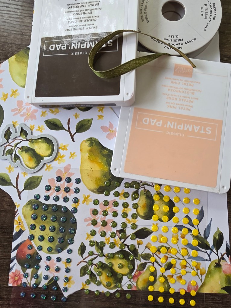
  • Embellishments: Mossy Meadow & Gold Ribbon, Low Profile Sparkle Dots
  • Paper Dimensions:
    • Basic White – 4¼” × 11″, 5⅛” × 3⅞”, 2″ × ½”
    • Painterly Pears DSP – fussy-cut pear cluster

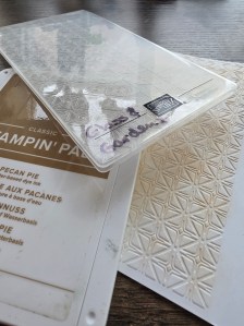
I began by embossing the smaller Basic White panel with the Glass & Garden Embossing Folders — their delicate texture instantly adds quiet movement. That tactile dimension always reminds me that even subtle pressure can shape something beautiful.

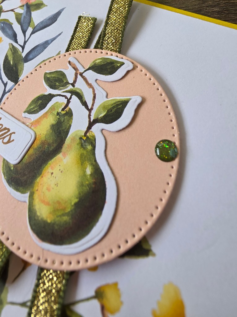
Next, I layered a fussy-cut pear cluster from the Painterly Pears DSP near the top corner, grounding it with a Mossy Meadow sentiment strip stamped “Congrats.”

Each brush of ink and ribbon tail felt symbolic: small acts of progress that lead to gratitude. The finished card has a balance of stillness and sparkle — a creative metaphor for calm in motion.

💡 Creative Tip: For added depth, lightly sponge Pecan Pie ink over your embossed surface before adhering your layers — it gives the texture an antique warmth without overpowering the white space.

Every handmade piece carries a story — not just of the paper or ink, but of who we were while making it.
This card taught me that growth doesn’t always come with a loud “before and after.” Sometimes, it’s quiet. Layered. Patient.

If you’ve ever felt like you’re standing still, remember: the roots of gratitude are growing, even when you can’t see them. 🌱

🔗 Continue Reading

You can find the Perfectly Pears Bundle, Glass & Garden Embossing Folders, and all featured supplies through my Stampin’ Up! shop here

Want to grow alongside fellow makers who understand that creativity is a healing process?
Join my Gems Paper Scissors VIP Group for daily prompts, project videos, and mindful inspiration.
👉 Join our Facebook VIP Group

Or sign up for my Tuesday Newsletter to receive weekly gratitude journaling tips and sneak peeks straight to your inbox.
👉 Subscribe via Constant Contact

Today’s behind-the-scenes photo set — including embossing details and color swatches — is up on Lemon8!
👉 @GemsPaperScissors on Lemon8

Gratitude doesn’t always arrive with fireworks.
Sometimes it looks like a pear in progress — ripening quietly under autumn light.
Today, let your creativity remind you how far you’ve come, and trust that every layer of ink and intention adds to your harvest of growth. 🍐💛